
Dark logo
For white, cream, and other light backgrounds.
These guidelines keep SplashCard recognizable wherever it appears. Use the files below as provided, keep the presentation simple, and let the card do the talking.
The full logo is the primary mark. Use the dark version on light surfaces and the white version on dark surfaces. The coral square mark may be used by itself only where space is limited, such as app icons and social avatars.
For white, cream, and other light backgrounds.

For black or very dark backgrounds.
 The SplashCard mark
Never redraw, crop, or place the mark inside another shape.
Keep the mark, wordmark, and “.app” together when using the full logo.
SplashCard is built on quiet neutrals with a single warm accent. Do not introduce new bright colors or gradients into core brand materials.
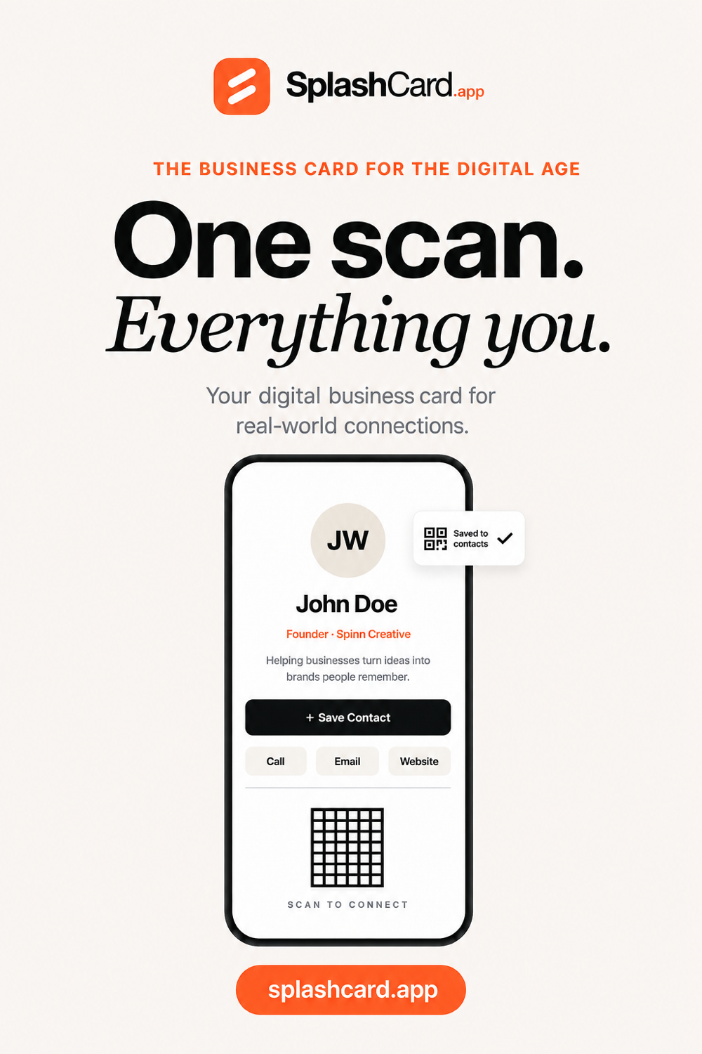
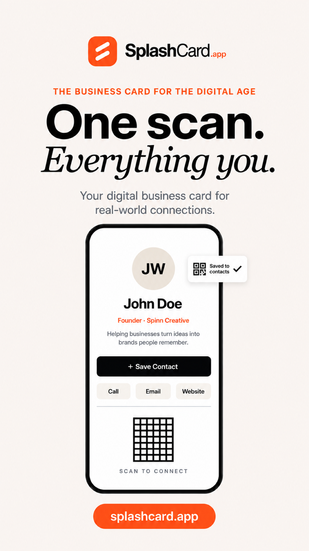
Use a confident, bold sans serif for practical statements. Use an italic serif sparingly for the expressive line, as in “Everything you.”
Leave at least the height of the coral mark around the full logo. Give it room to be recognized.
Keep the full logo at least 140 px wide on screen. Use the square mark when the full logo would be smaller.
Download the logo package for web, print, and profile use. The social kit includes correctly sized graphics for Facebook, LinkedIn, X, Instagram, Pinterest, and Stories.
Use these files as provided. For a custom request or a file format not listed here, email us.
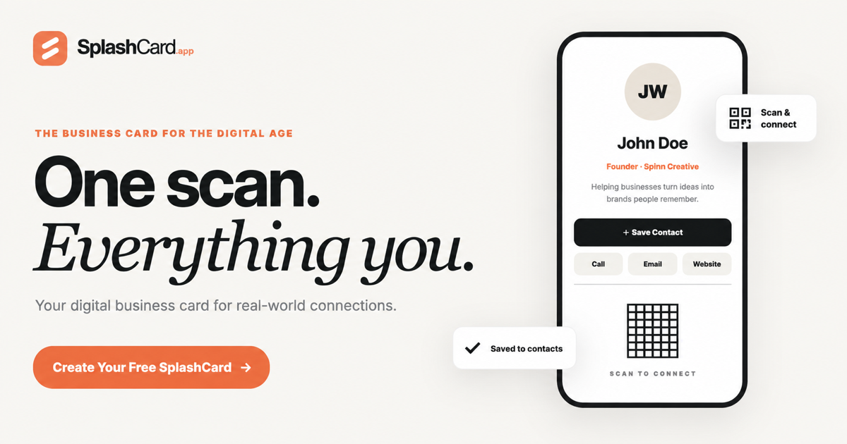
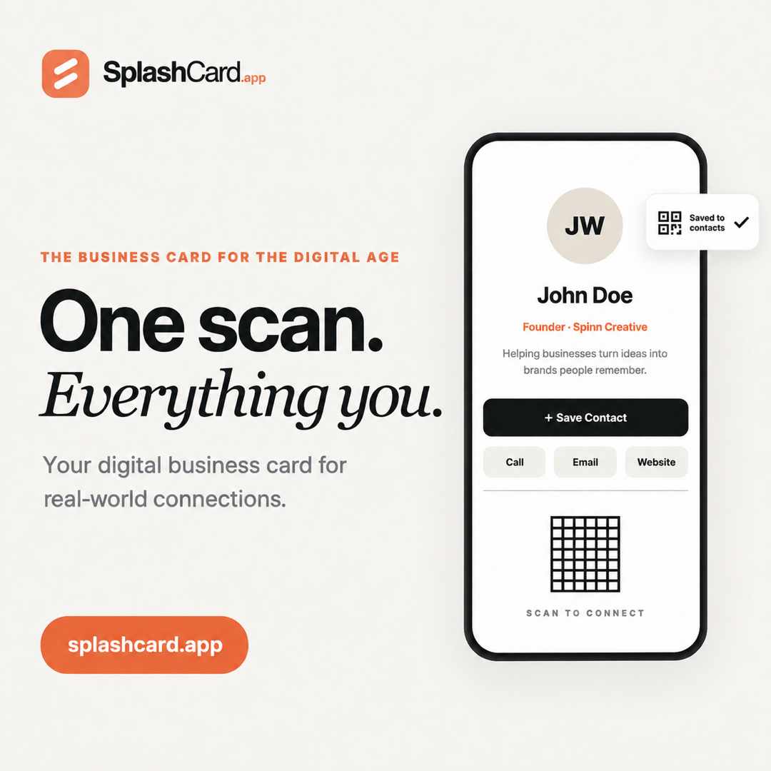
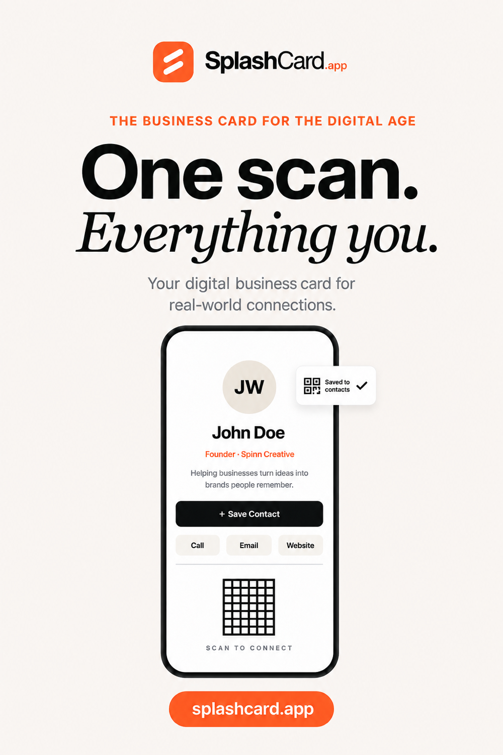
Use the horizontal graphic for website and Facebook sharing. Use the square, portrait, pin, or Story version for its matching social format. Select any preview to open the full-size file in a new tab.
For all brand inquiries, usage questions, and custom requests, email [email protected].